Welcome To BearMythology Version 2.0
If you have visited this site before, you might notice that it has completely lost its really gay light blue color (which also happened to be my favorite color). I just thought, “What the heck, let’s spruce up this joint.” Also, I feel that I have somewhat abandoned the blog for the past few months due to personal issues. So, I decided that I needed to change things up a bit and be more productive, which was why I have doubled my post counts this month (compared to the past two months alone). I’m making amends and will continue to post the best of the best this month (well, subjective of course, as it’s still all about my personal attractions). Unfortunately, I’m going on vacation next week which is also why I’m posting a lot as well.
One thing I added is an advertisement for the Children’s Miracle Network. I would just like to ask a favor and to please click on it when you get a chance (or even a few more times if you can). Basically, I picked a sponsor while you guys and gals voluntarily watch my sponsor’s ad. And based on the length of watching it and/or amount of click-thrus, this blog earns balloon points which, in turn, are used as monetary equivalent by my sponsor to donate to the Children’s Miracle Network. It’s for a good cause and I’d feel better knowing that the upcoming movie, bruno, will be doing something good. Anyway, the ad is on the bottom of the sidebar. And with that, I thank you very much…
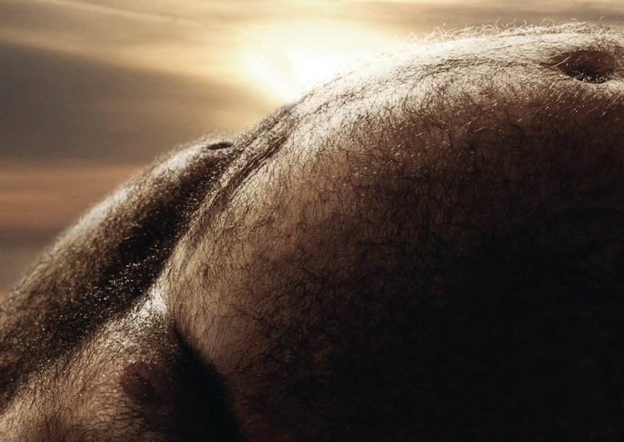
 I photoshopped away the biker in the above photo,
which you can find at AdsOfTheWorld
Speaking of advertisements, Içimdeki Ayi, had posted this pretty funny Doritos commercial…
I also want to apologize to those who’d email me or post on this blog and even the message board as I tend to be an absentee host. Just be patient with me and I’ll get to you. Mmkay? -_^
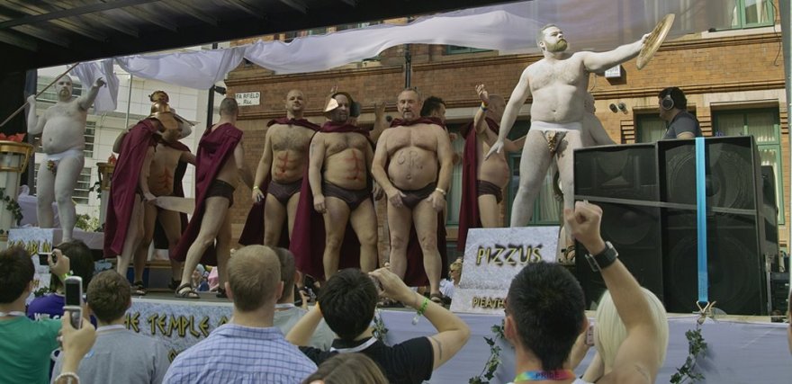
 Correct me if I am wrong, but isn’t that Sean of Hot Fur &
Britain’s Next Bear Model fame holding the “pizzus”?
Anyway, hope you guys like the new look. And, now, I’ll shut up and let’s get back to talking about bears, bears, and even more bears…
BIG HUGS,
Will
Posted in: Advertising, People, Photos, Random Musings, Videos, Web

wow, nice site! i love the upgrades to it. btw i know you watch wrestling but have you noticed wwe’s matt hardy? he’s gained a few pounds! woof!
Dear BearMythology,
[Luke voice insert]: Noooooooo!
I do indeed understand the desire to change your environment because of reasons specific to you; however I’m going to continue very honestly, and try not to sound rude at the same time.
The most immediate thing that comes to mind is that everything is presently too dark. It may be because of the new coloration, or it may be my perception, but the wording (especially at the tops of entries) seems smaller, contributing to a more claustrophobic feeling overall.
I don’t want to stick out here as the really negative one, as most of the time, I’m not like that in real life; and I do appreciate this place, and the work.
The cleanness – rather than ‘murkiness’ — of it was what helped me to become fond of it, though. The title once at the top, with the shore line and sky, was beautiful. To give one example, it matched the statue you still have at the top now. On a more minor note, it is also less inconspicuous to look at this website in more structured/confined areas now. I hope something can be worked out!
Have a good day!
P.S. Is it okay (or feasible/convenient) to contact you through you e-mail address, if I have different questions?
Let me raise you with…
[Anakin’s transformation to Vader]: NOOOoooOOOoooOOOoooOOOooo!
^_^
Seriously, thank you very much for such constructive criticisms. It hurt me outright when I changed my original light blue-colored theme. My perfectionist part is annoyed at the fact that certain posts would allude to the bluish color of the blog. And, yes, I love the shore line (which was part of the blog template). I also actually had it as my banner temporarily but it did not match the new blog.
And you are not being rude. I will try to see if there’s a way I can set this up where you can alternately switch from one theme to the other. Not sure if that’s feasible, but I’ll try. But my ultimate reason for going with this darker color was so that it’s not as noticeable. The images of shirtless men imposed within a cheery light blue color just screams “gay.” Not that it’s bad, but if you’re reading it in public, it looks a bit more subdued.
If you’re having a hard time reading the text, try zooming in on the page. I do this a lot on a lot of websites: CTRL+MouseWheel UP/DOWN (assuming you’re using Firefox). Does that help?
Anyway, let’s see what happens and thank you again. You can also email me at smashedbilly@yahoo.com
Haha!
I quite hope you discover a way to switch themes — That would be nice. For this theme though, perhaps a new shoreline picture could go at the top, to slightly contrast the dark-ness. About being more subdued (such as in public), that’s funny because it would likely be the opposite to me.
Plus, if in a potentially discomfiting situation before, I would just move to a portion of the page without pictures of shirtless guys, and with the light visuals, it would be okay with my circumstances.
Thank you for replying; and good evening.
Oh, and okay, at least I know you are open to e-mail, if occasion should come.
No complaints here. Diggin the new version.
The blue Is my favorite color too,but I like the new look.Thank you for thinking bout the possible need to keep things discrete In public,not that I would mind reading this blog In public.
Will, If your partial to blues I can help you redesign your Runboard.